Visualize social statistics fast, clear, and shareable
Paste a table or upload a CSV, describe your question and Vizionary returns the right chart—sorted, labeled, and explained.
Trusted by 50k+ students
Why Choose Vizionary
Use Cases
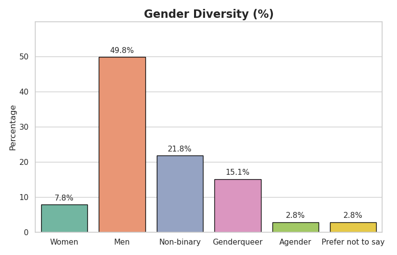
Gender diversity split
Visualize how a group is distributed by gender (e.g., male, female, nonbinary) with clear counts and percentages.
Life Expectancy Over Time
Track years of life expectancy across decades; highlight increases/declines and % change. Chart: Line chart with trend annotations.
School Completion Rate by Region
Compare completion rates by region, gender, or year; surface gaps at a glance. Chart: Grouped/stacked bar or multi-line by cohort.
From question to clear answer—fast.
Join thousands of people getting clear answers with professional charts
